
Mocaas is a no-code web streaming platform builder that helps creators monetize their content. When I joined the team, we already had a style guide, but it did not cover all the components resulting in some consistency in the product.
Audited the existing UI to review the current interface and identify inconsistencies in typography and components.
Facilitated a Design system workshop with designers and engineers to align the goals, scope, and vision for the design system.
Build the design system using Atomic design.
Implemented Design tokens for better developer adoption .

I audited and I inventoried each component in Coda to list the available component and understanding the pattern. Through this, we discovered:
Multiple styles, text weights, and sizes were used for buttons and badges.

Banners and toggles did not use consistent colors to convey messages such as active, success, error, or information.

Lack of consistency in style for building the components, in example border were using different color and border radius.

Modals and checklists were styled inconsistently across different pages.

I facilitated a workshop for designers, engineers, and product manager to align the team in objectives and expectations for the design system. The workshop included an introduction to design system, a demo, and concluded with an open discussion.
Introduction to what, why, and how we build the design system.
Aligned the teams on the goals to create consistent and scalable system.
Discussion about practicality and usability of the design system.

We adopted the Atomic Design methodology by Brad Frost as the core of building the component. This approach allowed us to break the UI down into small reusable components. With this then we can create bigger section and interface that can be scaled and maintain the consistency.
Organized component and reuse patterns.
Maintain consistency in product.
Made onboarding easier for new designers and developers.

To make sure that the designers and engineers refer to the same element in handoff, we implemented design tokens in the foundation.
Created a single source of truth shared between Figma and code.
Reduced manual handoff errors between designers and engineers.
Allowed automated updates when base values change.

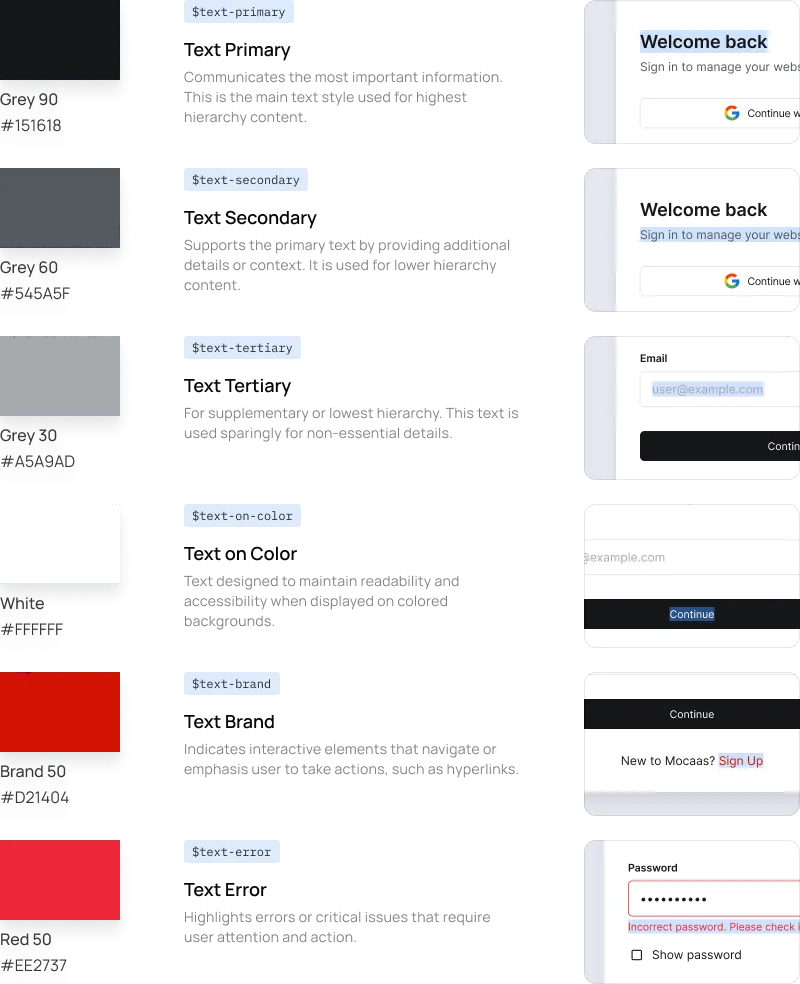
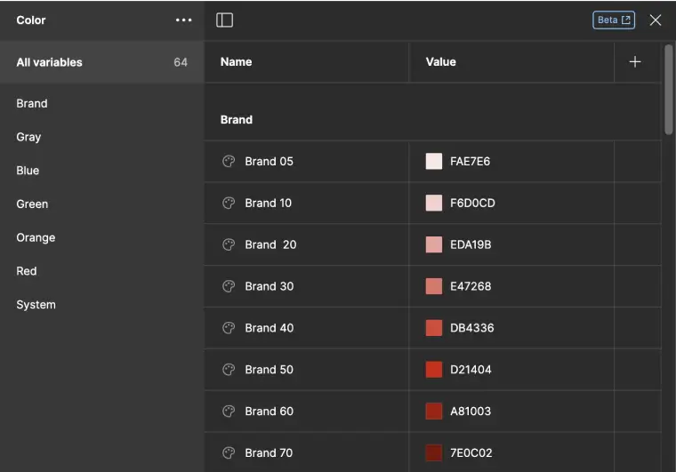
Red Mocaas (HEX #D21404) as primary color and complemented by a neutral gray.


Uses the Inter typeface in Regular and Semi-Bold weights, with a base size of 16px.

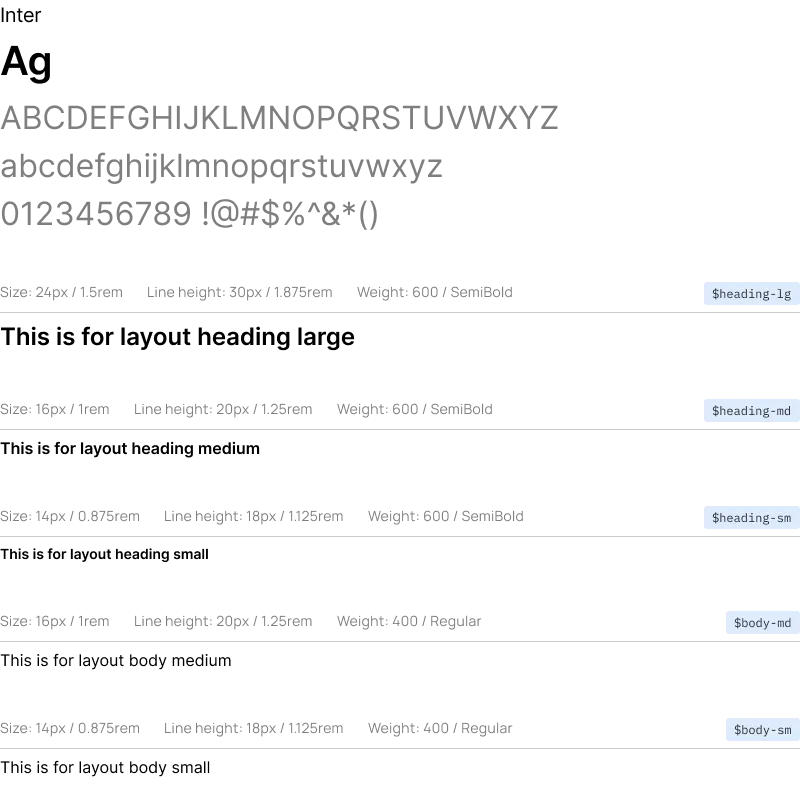
Follows a 4px grid to maintain consistency.


We uses Font Awesome, with 24px as the standard size and 16px for the small size.

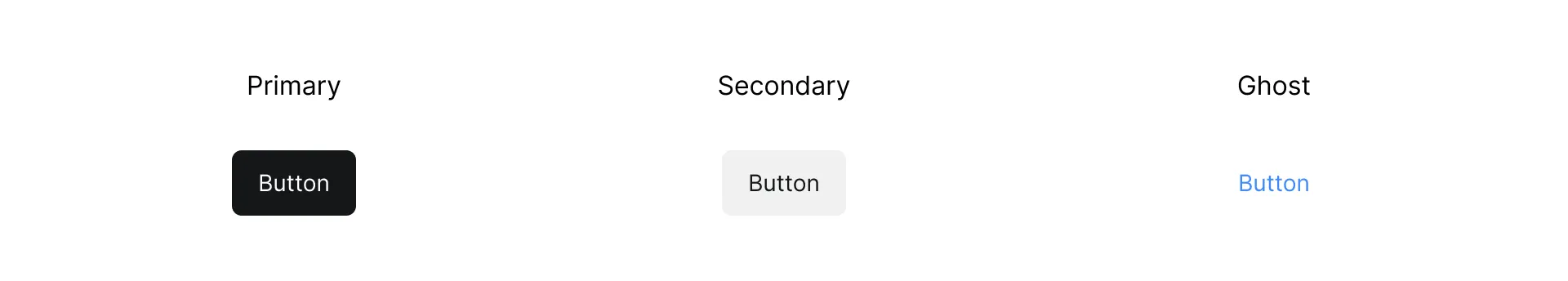
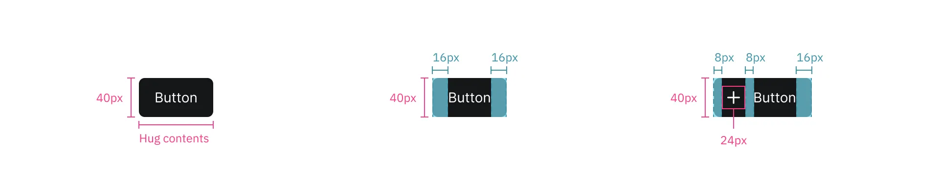
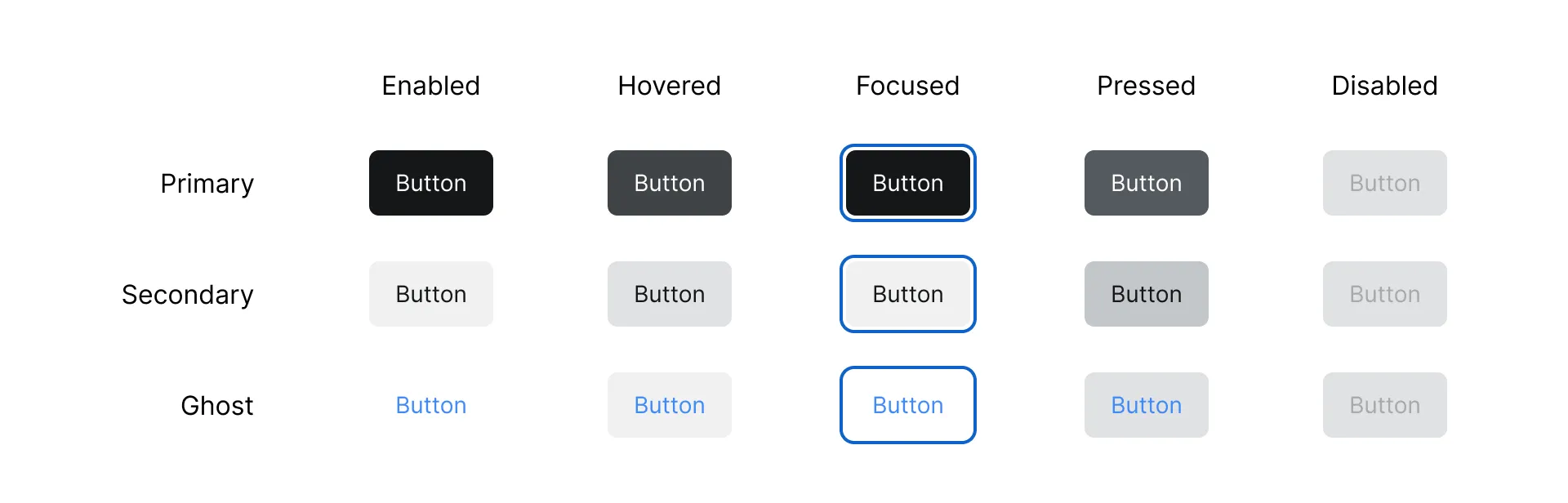
Buttons are interactive elements that trigger actions when clicked. Mocaas includes 3 style to indicate hierarchy.
Can contain an optional leading icon
Icon: standard size icon of 24px
Types: primary, secondary and ghost
Keep labels concise and in sentence-case
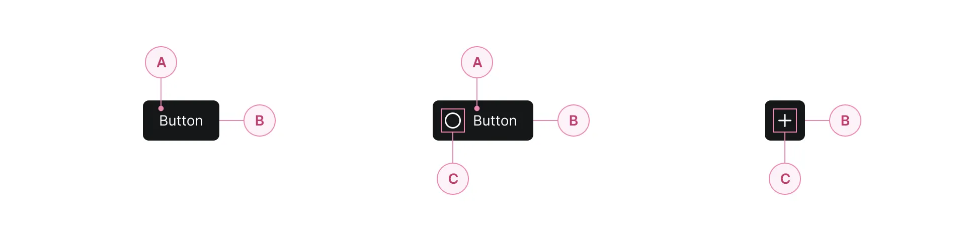
Label text
Conatiner
Icon
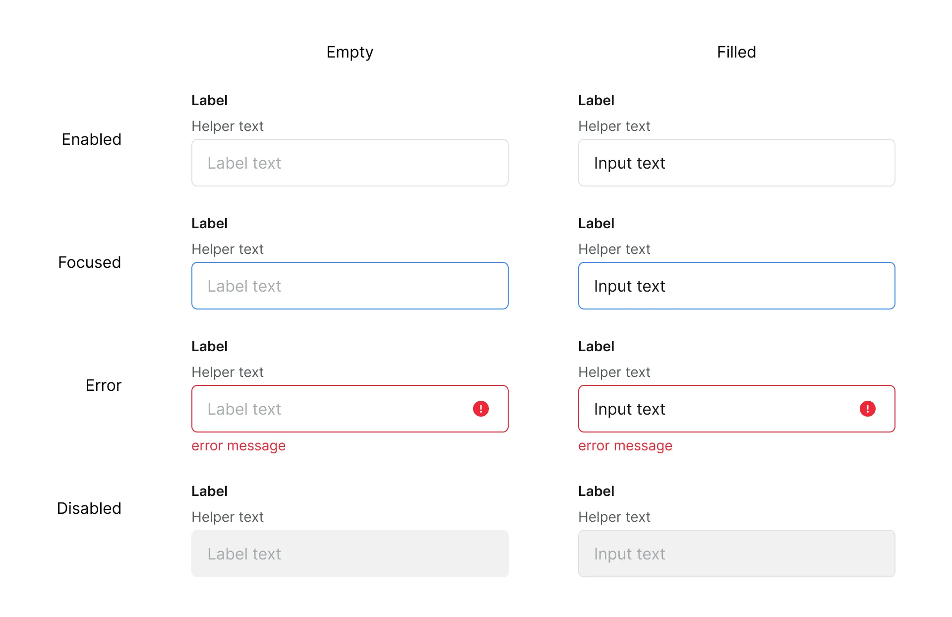
Text inputs allow users to enter and edit text-based data. They can be used for inputs like names and emails or longer inputs like comments.
Can contain an optional trailing icon
Icon: standard size icon of 24px
Types: enabled, focus, error and disabled
Keep labels concise and in sentence-case

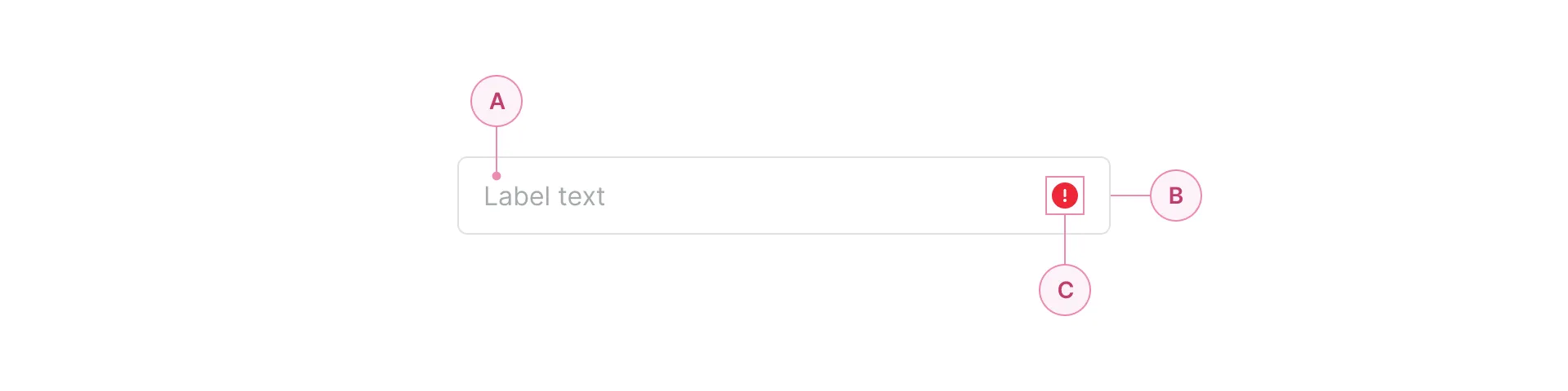
Label text
Conatiner
Icon

Tags are small labels used to filter or highlight key information. They help users quickly identify attributes such as status or categories.
Can be removable or non-removable
Can contain an optional leading and trailing icon
Icon: small size icon of 20px
In Figma's Config 2023 keynote, Local Variables for the Design System are introduced. We implemented this feature to store values for design elements.
After we finish create the 1.0 of the design system, the task is not yet done. Now we need to continue maintain it as design system is a living documents.