IntroProblemGoalPlanningValidationSynthesisDesignOutro

Qubiql. Streamlining task management and collaboration tools.

Role
UI/UX Designer
Company
DesktopIP
Timelines
May 2022 / 2 weeks
Deliverables
UX research report
Website redesign
Qubiql UI preview
Introduction

Qubiql - All in one task management

Qubiql is a early stage startup focusing on task management (to-do lists, reminders, and notes). It also enable you to collaborate with others, with its virtual desktop feature and team management capabilities.

What I did in this project:
  • Identified UI/UX issues through a heuristic evaluation.

  • Conducted usability tests and in-depth interviews to gather relevant data

  • Performed competitor analysis to get a broader perspective of the market

  • Analyzed research data, presented findings, and design solutions recommendations based on the results

Problem

Navigating Qubiql’s growing complexity

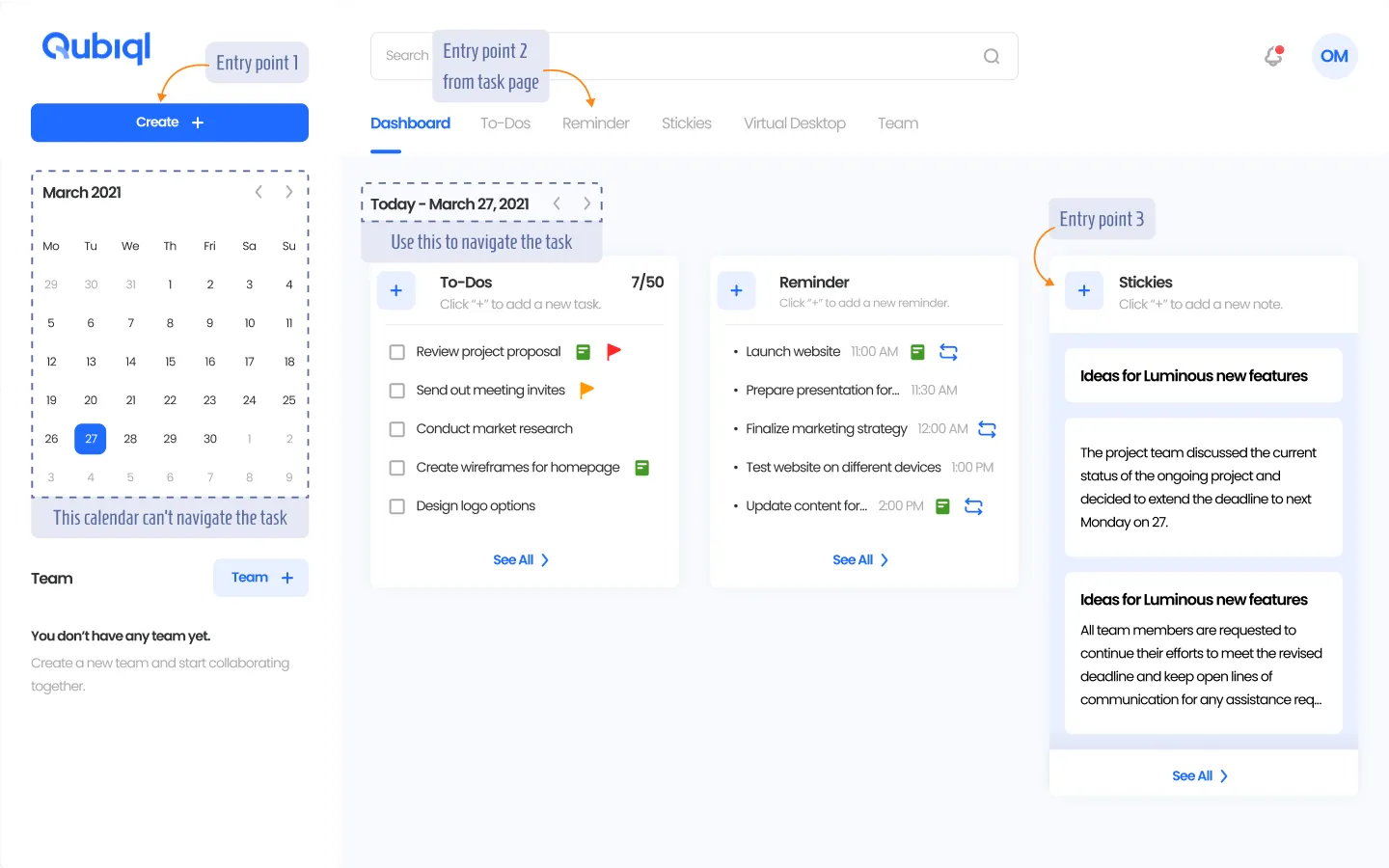
As the product grew, so did complexity. This led to an inconsistent structure and friction in how users created and managed tasks. Some noticabale one including:

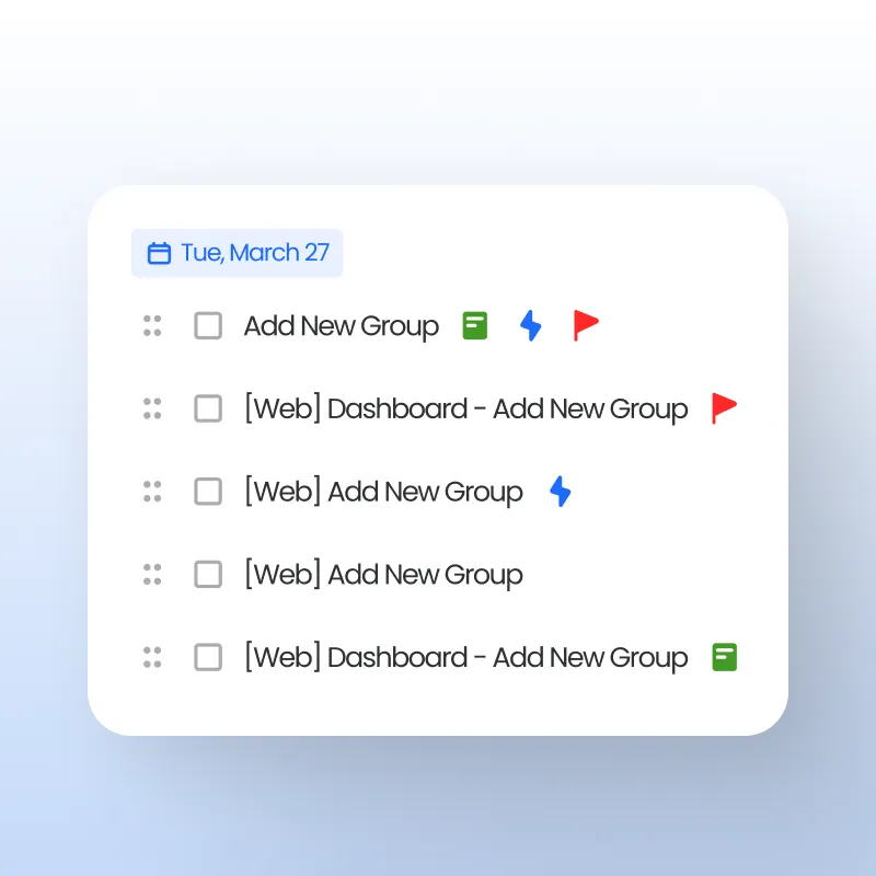
  • Calendar view lacked usability, make it harder for user to navigate.

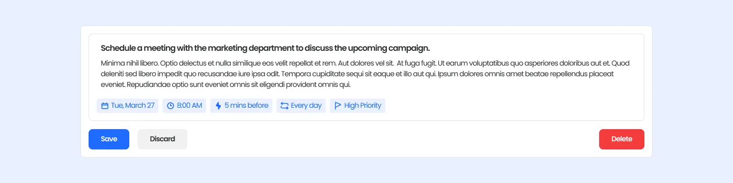
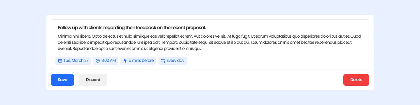
  • Multiple entry points for creating tasks.

Old Qubiql UI
Goal

Reorganize the information architecture and increase findability of the features

  • Gain insight into how actual users engage with Qubiql.

  • Identify any issues in the design or functionality.

  • Identify potential areas for improvement in both the design and functionality.

Planning

Quick, focused, and impactful research

This was the first user research initiative conducted for Qubiql — and also the first within the company. To keep it short and actionable, we planned it as small-scale project. The entire process, from planning and user testing to final presentation, was completed in 2 weeks.

We limited the scope of our research and defined the reseach questions as follow:

  • How do users create new tasks from the dashboard?

  • How do users find tasks by date?

  • How do users manage tasks with different status?

Research timeline

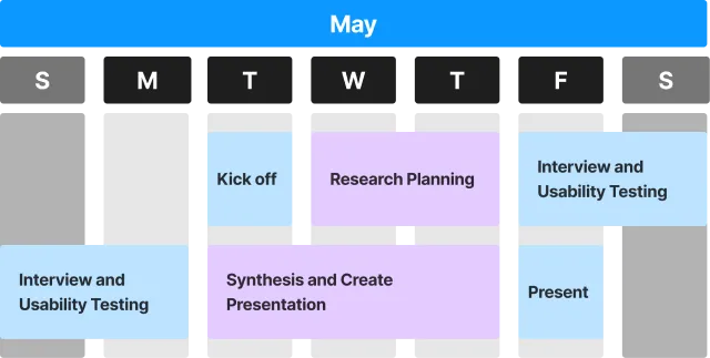
Image: Research timeline

Validation

We tested what already existed to understand real pain points

We ran tests using the live product with three internal participants. Although the sample was small, each session lasted one hour and yielded valuable insights about confusion and inefficiency in task flow. We also conducted heuristic evaluations and performed a competitive analysis.

Research results

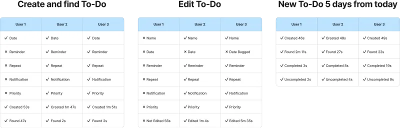
Image: User research summary

Synthesis & Key Insights

The experience of adding and finding tasks was harder than it needed to be.

From the research we identify recurring pain points, uncover patterns in user behavior, and validate hypotheses related to task creation and management.
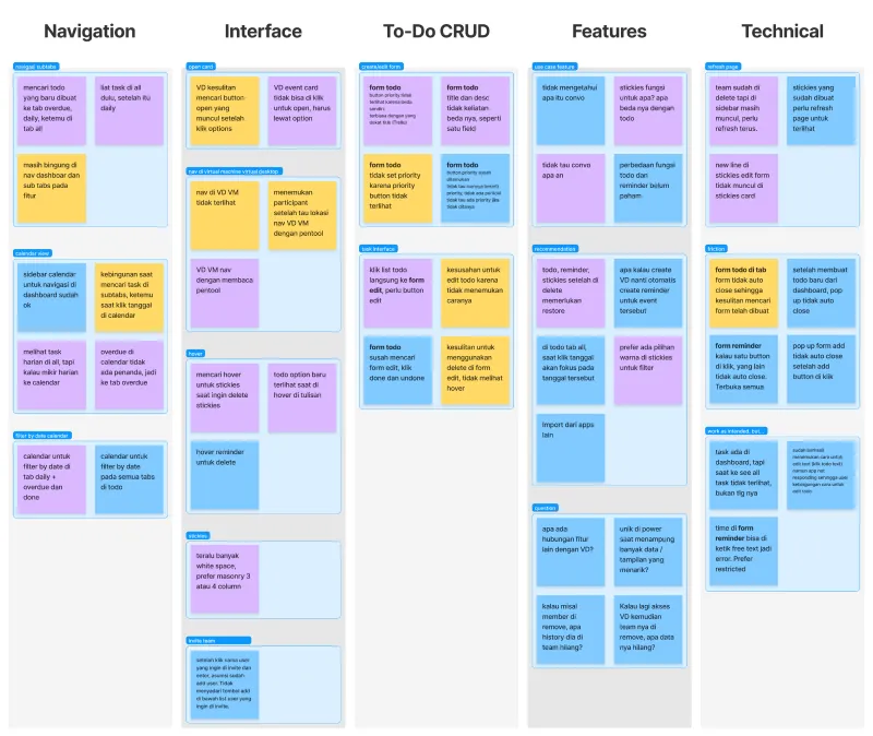
Key insights
  • Users expected one consistent way to add tasks.
  • The current layout didn’t help users browse or filter tasks easily.
  • Interface clutter reduced focus and increased errors.
Sticky note diagram

Image: Card sorting

Findings -> Recomendations

Simplified flows and a clean layout.

1. Unified task creation flow

Too many entry points caused confusion in creating tasks.

finding icon
FINDINGS
  • There were 3 different entry points for task creation, but each lacking clear distinctions in purpose or design.
  • This led to user hesitation and inefficiency.
recomedation icon
RECOMENDATIONS
  • Streamline the process into one clear  entry point to reduce cognitive load and simplify the workflow.
Unified task creation

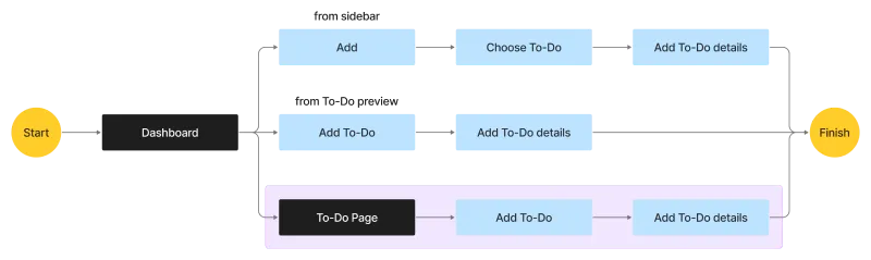
Image: User journey — the selected flow is highlighted in purple

2. Redesign the dashboard layout

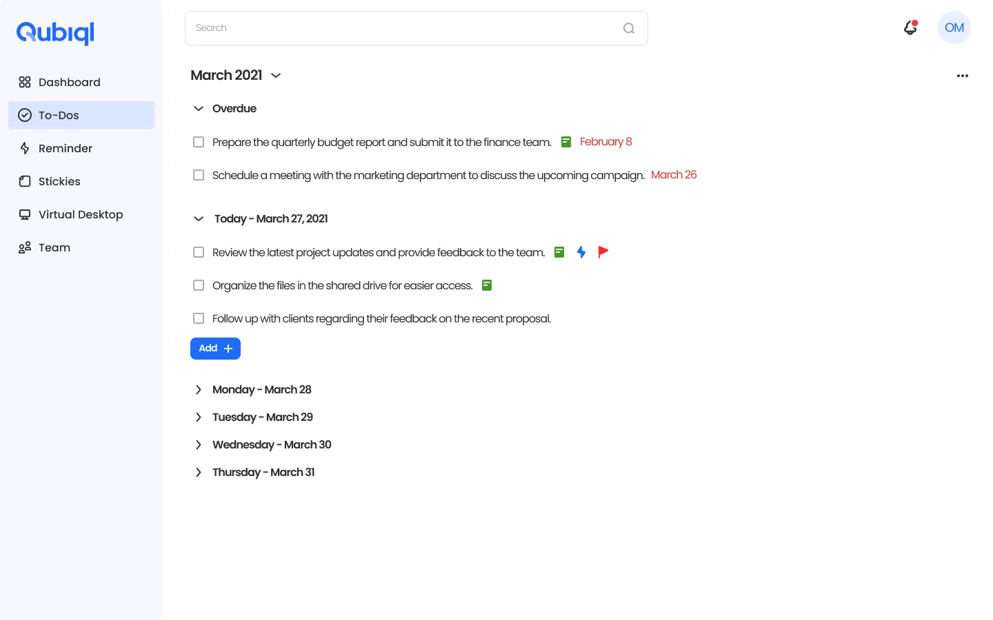
The calendar in sidebar take much space without enough usability.

finding icon
FINDINGS
  • The calendar in the sidebar could not be used for date-based navigation; it only displayed the current date.
  • The calendar also took up some space, especially noticeable on laptop screens.
recomedation icon
RECOMENDATIONS
  • Remove the static calendar and replace the date indication with a textual display showing today’s date and a personalized greeting (e.g., "Hi [Username]").
New dashboard

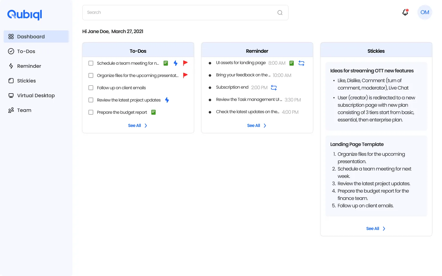
Image: New dashboard UI for Qubiql

3. To-Do and Reminder features

Users struggled to differentiate between To-Do and Reminder tasks.

finding icon
FINDINGS
  • To-Do and Reminders were perceived as the same feature due to similar UI presentation.
  • Task filtering was limited to "Today" and "All", making task planning on multiple days difficult.
  • The tab navigation status is illustrated a same tier for task between task (Today, Overdue, Done, All).
  • The “All” section was slow to load because it fetched all tasks at once.
recomedation icon
RECOMENDATIONS
  • Create the design to focused on the task item to highlight the difference for each features.
  • Implement a grouped-by-month view to improve loading performance, with daily sections for easier review of today’s and upcoming tasks.
  • For To-Do: Highlight overdue tasks at the top and label the overdue text in red color. Move completed tasks to a separate page.
  • For Reminder: Make past reminder more subtle with grey text color and use bold black for upcoming ones. Recurring reminders are now marked with a recurring icon for better visibility.
New todo - All taskNew todo - Done task

4. Improving UI consistency and usability

Apply responsive interface and consistent UI in form component for all features.

finding icon
FINDINGS
  • Buttons were only clickable on the text label, not the full component area.
  • UI elements lacked interactive feedback (e.g., no hover or click states).
  • Many icons in the task interface were unlabeled, making it unclear what they did.
recomedation icon
RECOMENDATIONS
  • Increase the clickable area for buttons to improve accessibility.
  • Add state variations (hover, active, disabled) to create a more responsive UI.
  • Use icon + text combinations to improve clarity and reduce confusion.
  • Apply the pattern in other form component as well to maintain consistency.
Form todoForm reminder
Thank you!

Lessons Learner + Next Steps

Lessons Learned
Consistent UI and lean UX research.
  • Small scale research is better than no research.
  • A consistent UI isn’t just aesthetic, it support the product functionalityy
Next Steps
Iterative design process to further improve the product.
  • Plan a second round of external usability testing
  • Expand task filtering and sorting options
  • Explore personalization features based on task behavior